CREATIVE SERVICES ANIMATION ART DIRECTION CAMPAIGN EDITORIAL
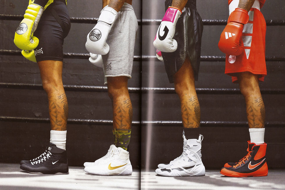
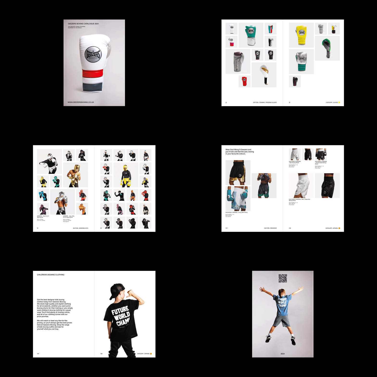
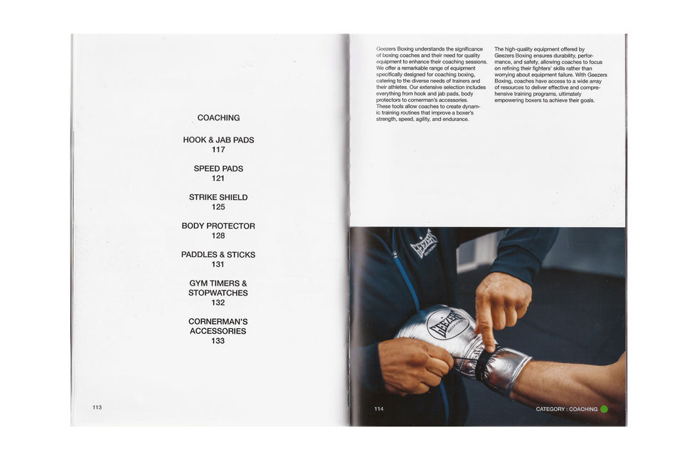
INFO THE BACKGROUND Geezers Boxing, initially starting from a humble warehouse in rural Norfolk, has evolved into the largest boxing retailer in Europe. The brand now serves as the go-to destination for a wide range of boxing gear, including boxing gloves, footwear, coaching equipment, personalised ringwear, and punchbags. They offer an extensive selection of top-tier boxing brands. While their own brand initially took a backseat, it has recently gained prominence, earning recognition for its exceptional craftsmanship, style and intricate product design. THE GOAL The challenge was to create a unified brand system that would solidify Geezers Boxing as a market leader; whilst effectively highlighting their distinctive blend of craftsmanship, innovation and knowledge. THE SOLUTION Creating a uniform brand voice for Geezers Boxing was achieved by employing typography in a consistent and hierarchical manner across all touchpoints. Complimentary art direction was integral in shaping Geezers' brand vision. It aimed to showcase the products' faultless craftsmanship. Whilst, the portrayal of boxers and models are characterised by blending raw, rugged power with an artistic sensibility, akin to that seen in fashion photography.


